Introduction
The "green rush" aesthetic is over. Neon cannabis leaves on black backgrounds no longer signal quality — they signal a brand stuck in 2020.
Color drives 62% of purchase decisions within 7 seconds of visual exposure (University of Loyola). Yet most cannabis brands choose packaging colors based on founder preference or design trends rather than a systematic understanding of how color influences buyer behavior.
The 2026 shift is toward "color-as-system" — mapping hues to product effects, price tiers, and brand narratives, while navigating compliance constraints that can break a poorly designed scheme. Color increases brand recognition by 80%. The wrong color system increases regulatory risk and shelf confusion at the same rate.
The Science — How Color Drives Cannabis Purchase Decisions
Emotional Priming at the Shelf
Color perception bypasses rational analysis and triggers immediate emotional associations. For cannabis consumers, three dimensions matter:
Potency signaling: Dark, saturated colors (deep purple, charcoal black) consistently correlate with perceived higher potency. Lighter pastel palettes read as milder, regardless of actual THC content.
Quality inference: Consumers judge packaging quality within 90 milliseconds. Matte finishes with controlled palettes score consistently higher than glossy multi-color designs.
Safety perception: Blue and white combinations trigger pharmaceutical/medical associations — which is why CBD brands default to this palette even when targeting recreational users.
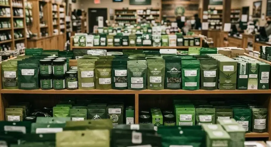
The Green Trap
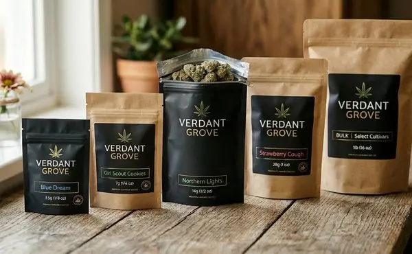
The most obvious color for a cannabis brand is also the most damaging. Over 60% of cannabis packaging on dispensary shelves uses green as primary or secondary color. When every brand uses the same cue, differentiation stops — color becomes noise.
Result: consumers cannot distinguish brands on the shelf, purchase decisions default to price or THC percentage, and brand equity erodes.
Color and Price Tier Signaling
| Color Direction | Consumer Inference | Typical Price |
|---|---|---|
| Dark, saturated, controlled | Premium, craft | $40+ |
| Mid-tone earth tones | Natural, wellness | $25-40 |
| Bright, high-contrast, multi-color | Value, entry-level | $15-25 |
| Pastel, muted, minimal | Boutique, lifestyle | $30-50 (niche) |
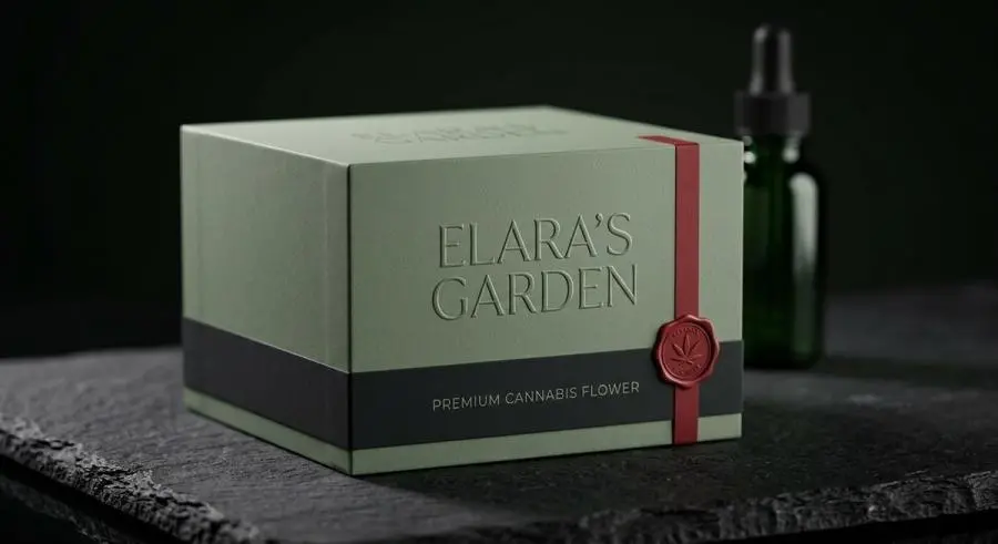
Fewer colors + darker saturation = higher value signal. But only when intentional. Random minimalism reads as cheap just as easily as intentional restraint reads as premium.
The 2026 Color Palette Shift — From Neon to Restrained
What's Declining
The visual language that dominated cannabis packaging from 2018-2024:
Fluorescent greens and neons: Associated with black market, increasingly avoided by regulated-market brands
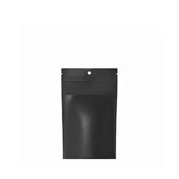
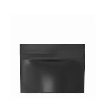
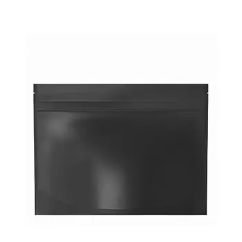
Harsh black backgrounds: Once "premium," now generic — over 35% of cannabis packaging still uses black as primary
Glossy finishes: Poor e-commerce photography performance (glare, reflections); feel less premium than matte
Busy multi-color layouts: Make strain/potency/format information harder to find at a glance
What's Rising
The 2026 palette direction is restrained, intentional, and functionally driven:
Earth tones: Olive, teal, warm gray, sand, terracotta — natural without relying on literal green
Single dominant color + white space: One color doing the heavy lifting, generous negative space for legibility
Matte finishes: Soft-touch coatings and uncoated paper stocks that photograph better and feel premium
Case Studies
PUREFIRE (Industria Branding Co.): Muted sage (calm) + deep charcoal (sophistication) + aggressive red accent (urgency). Deliberately rejects botanical greens for an urban, street-culture identity. Red appears only as accent, reading as intentional rather than loud.
The Goddess Experience (Device Creative Collaborative): Mood-based color system where each variant signals the desired feeling — uplifted (warm gold), relaxed (deep indigo), focused (vibrant coral). The palette is a navigation tool, not decoration.
Holler Cannabis Co. (Kentucky, launched May 2026): Color tied to place — gold (Kentucky sun), deep orange (autumn landscape), dark teal (bluegrass region). Tells a story without cannabis clichés.
ARLO: Muted earth tones with embossed tactile details. Color sorts across strains — consumers learn the system and find products without reading labels.
The Matte Finish Advantage
Soft-touch matte coatings solve multiple problems: - Eliminate glare in retail lighting and e-commerce photography - Resist fingerprints and scuffs better than gloss - Communicate tactile quality associated with premium products - Photograph consistently across different lighting conditions
Color as a Functional Sorting System
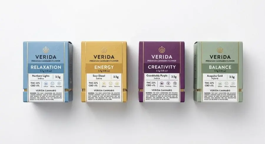
Mapping Colors to Effects
Sophisticated cannabis brands in 2026 use color to communicate effects:
| Color | Consumer Association | Best Product Fit |
|---|---|---|
| Soft blue, cool tones | Calm, relaxation, sleep | Indica flower, night-time edibles, CBD |
| Warm yellow, orange | Energy, focus, sociability | Sativa flower, daytime edibles |
| Deep purple | Creativity, indulgence, premium | Craft flower, high-potency concentrates |
| Green (muted sage/olive) | Wellness, balance, natural | Hybrid flower, full-spectrum |
| Red (sparingly) | Intensity, potency, urgency | High-THC, limited editions |
Key: consistency. Blue should appear on every relaxation product across the entire line — not just one SKU because the designer liked the color.
Multi-SKU Architecture
Brands with 10+ SKUs need a two-axis color system:
X-axis (product type): Consistent color per category — flower in one palette, edibles in another, concentrates in a third
Y-axis (effect/strength): Saturation variation within each category — lighter for mild, more saturated for potent
Consumers learn the system once and apply it across all purchases. No label reading required.
The Compliance Challenge
Mandatory warning labels and universal THC symbols are not color-neutral. Most states require high-contrast warning text, specific THC symbol colors, and minimum contrast ratios.
These requirements can destroy a carefully designed palette. Solution: design the color system around compliance elements from the start. Reserve a panel for mandatory elements in a neutral color block, keeping the brand palette intact on the main viewing area.
Navigating Regulatory Constraints Without Breaking the Palette
Pharmaceutical Aesthetic Mandates
Several states restrict packaging that appeals to children — increasingly interpreted as restricting bright, saturated colors:
Oregon: Guidance against "bright colors" and "cartoon-like imagery"
Washington: Restrictions on "candy-like" packaging appearance
Colorado: Evolving enforcement around color brightness and child appeal
Practical impact: earth tones and muted palettes are a compliance hedge. A pharmaceutical-looking palette is less likely to trigger scrutiny than one that looks like candy packaging.
Warning Label Integration
Most warning labels require specific contrast ratios (white on black or black on white). Brands with mid-tone primary palettes face a problem: no compliant warning color will contrast adequately.
Fix: always include a black or white color block in your system specifically for compliance elements. This becomes the designated warning zone, keeping the rest of the palette clean.
CR Mechanism and Coating Interactions
Coatings and inks affect the friction coefficient of child-resistant mechanisms. High-gloss coatings on CR push-and-turn closures reduce grip, causing adults to fail opening tests. Matte finishes generally provide better grip but may wear differently over repeated openings.
Test the color finish on the actual CR mechanism before committing to full production. A beautiful palette that causes 5% of adults to fail the CR test is a regulatory disaster.
Practical Color System Design for Cannabis Brands
Building a 3-Color System
Primary color (60%): Dominant brand color — choose based on emotional association and target shelf environment
Accent color (10%): High-contrast for key information — potency, strain name, product type
Neutral color (30%): White, off-white, or light gray for text backgrounds and compliance elements
This ratio ensures brand visibility while maintaining legibility and compliance flexibility.
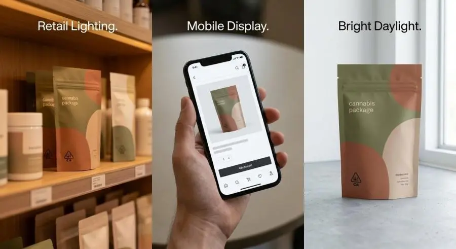
Testing in Context
A color system that looks perfect in a studio can fail in three real-world contexts:
Retail shelf: Test next to competitors. If it blends in at 10 feet, increase saturation or contrast.
E-commerce thumbnail: Reduce to 200 pixels wide. If brand name and product type are unreadable, contrast is insufficient.
Lighting variance: Test under warm retail (2700K), cool dispensary (4000K), and natural daylight. Some color pairs become unreadable in certain light.
Pantone Consistency Across Substrates
The same Pantone color appears differently across materials:
Coated paperboard: Standard Pantone formula
Uncoated/recycled paperboard: Increase saturation 10-15% to compensate for absorption
Plastic film: Reduce saturation 5-10% for natural gloss amplification
Glass: White backing layer + increased opacity
Future-Proofing
Leave room for: - Seasonal limited editions using the accent color in new ways - Strain-specific variants shifting primary color within a defined range - Collaborative products blending two brand color systems
A rigid palette that cannot accommodate these will need a full redesign within 18 months.
Conclusion
Color is the most cost-effective brand differentiator in cannabis packaging. No new materials, machinery, or suppliers needed — just a systematic approach instead of an intuitive one.
The brands winning in 2026 share a pattern: they treat color as a strategic system, not a decorative choice. They map colors to effects, design for compliance from the start, and test relentlessly in real-world conditions.
Bottom line: Audit your palette against 2026 trends. Reduce to three colors. Switch to matte finish. Test as a 200-pixel thumbnail before committing to print. The difference between a color system and a color choice is the difference between a brand that gets noticed and one that blends in.