Introduction
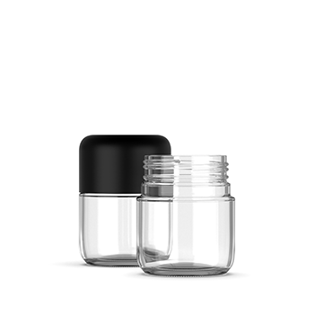
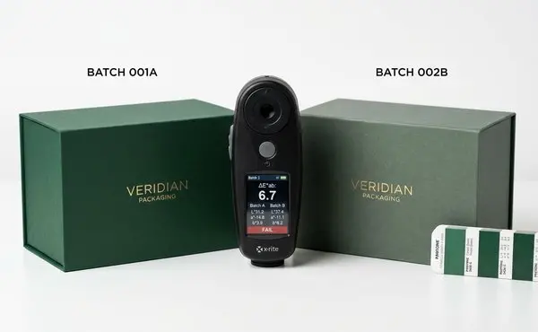
You spent months perfecting your brand colors. Signed off on the Pantone chips. Approved the digital proofs. Then the second batch arrives, and the "forest green" you chose looks nothing like the first run. The jar on the left (batch one) is deep and rich. The jar on the right (batch two) is muddy, leaning olive.
Batch-to-batch color variation is the most common visual complaint in packaging procurement — and the one brands are least prepared to handle. Inconsistent colors erode brand recognition, confuse customers, and force expensive reprints that delay launches by weeks.
Four root causes. One measurement system. A certification framework that keeps suppliers honest. And a step-by-step system any brand can implement.
1. Why Brand Colors Drift — The Four Root Causes
Color variation between batches is not an accident. It is the predictable result of four variables.
1.1 Ink Variability
Ink is a chemical formulation, not a fixed quantity. Every batch has slight differences in pigment concentration, binder ratio, and viscosity. Switch ink suppliers between runs — or use a different batch number from the same supplier — and the printed color shifts.
The fix: specify that your color must be matched using the same ink formulation across all runs. Document ink batch numbers in a "batch passport."
1.2 Substrate Inconsistency
Paper and board are natural materials. Two lots of the same grade can differ in whiteness, smoothness, absorbency, and moisture content. A color that looks right on bright white stock looks dull on a slightly warmer substrate — even with identical ink.
The fix: require the same mill and grade across runs. Requalify color if the substrate changes. Store a reference sample with your color standards.
1.3 Press Conditions
Every printing press is a system of variables: roller pressure, running speed, drying temperature, anilox wear (in flexo), plate wear. A press at 95% of standard pressure can shift color by ΔE 2-3 — enough to fail a premium brand's tolerance.
The fix: your supplier should maintain documented press profiles for your job, including target pressure, speed, and temperature. Verified at the start of every run.
1.4 Environmental Factors
Temperature and humidity directly affect ink behavior and substrate dimensions. The industry standard: 20-23°C at 45-55% RH. Outside that range, ink dries faster or slower, paper expands or contracts, and color drifts.
Lighting matters enormously. "Metamerism" — two colors matching under one light source but not another — is a common source of disputes. Standardize on D50 (5000K) lighting for all evaluations.
Real-world benchmark: TrailBite Foods improved their ΔE from an unacceptable 5-7 down to a steady 2-3 after implementing inline spectrophotometers and climate-controlled pressrooms. First Pass Yield rose from the low 80s to 90-93%. Changeover time dropped 15-20 minutes per SKU.
2. Understanding Delta E — The Universal Language of Color Accuracy
If you take one thing from this article, make it this: put Delta E tolerances in every supplier contract.
2.1 What Is ΔE?
Delta E (ΔE) is a single number that quantifies the perceived difference between two colors — accounting for lightness, hue, and saturation. Lower number = closer match. It is objective, repeatable, and enforceable. Unlike "this looks different to me."
2.2 The Tolerance Tiers
Your tolerance should match your market positioning:
| ΔE Range | Perception | Best For |
|---|---|---|
| ΔE < 1.0 | Imperceptible even under close inspection | Luxury, premium spirits, cosmetics |
| ΔE 1.0–2.0 | Noticeable only side-by-side | Premium cannabis, consumer electronics |
| ΔE 2.0–3.0 | Visible but often acceptable | Mass-market consumer goods |
| ΔE > 3.0 | Clearly mismatched | Typically reject for branded packaging |
For cannabis brands: specify ΔE < 2.0 for primary packaging (the box or jar the customer sees) and ΔE < 3.0 for secondary packaging (shipping cartons, displays).
2.3 How to Write ΔE Into Your Contract
Include a specific clause:
"All printed packaging must achieve a Delta E (ΔE 2000) of 2.0 or less versus the approved color standard, measured under D50 illumination at a 2-degree observer angle. Disputes resolved by certified third-party spectrophotometer."
If the supplier pushes back on ΔE < 2.0, ask what tolerance they hold for their best clients. Their answer tells you their capability.
3. The G7+ Certification — A Shared Color Language for the Supply Chain
3.1 What Is G7+?
G7+ is a calibration methodology from IDEAlliance that aligns color across different printers, substrates, and technologies. A shared language between brand owners, prepress houses, and printers. A G7-calibrated job moves from proofing to production press with predictable results.
3.2 Growing Adoption in 2026
The G7+ community is expanding fast. Major 2026 events include the G7+ Exchange Conference Asia (Bangkok, Hanoi, Ho Chi Minh City) and the Japan G7 Forum. Packaging-specific G7 Master Qualification is increasingly demanded by pharma and consumer health brands — where "close enough" is not an option.
A G7-certified supplier hits your target color on first pass more consistently, because their entire workflow calibrates to the same neutral print density curve.
3.3 What to Ask Suppliers
In your RFQ:
Is your facility G7 Master Qualified? (Not "we follow G7 principles" — ask for the qualification number.)
What is your typical First Pass Yield for color approval?
Do you use inline spectrophotometry with real-time ΔE monitoring?
Can you provide batch passport documentation for each run?
Hesitation on any of these tells you what you need to know.
4. Building a Color Management System — What Brands Can Control
You don't need to own a printing press to control color. You need a system.
Step 1: Define Your Color Standard
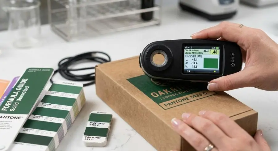
A color standard is not a digital file. A hex code on a website is useless for print. Your standard must include:
Physical standard — Pantone chip, drawdown, or printed sample, laminated and stored in the dark
Spectral data — A spectrophotometer reading stored as digital reference
Substrate reference — The exact paper/board the standard was printed on
Keep a master set in your office and a duplicate with your supplier. Check them annually.
Step 2: Pre-Production Approval
Before any production run:
Approve a digital contract proof (ideally G7-certified) showing expected color on your substrate
Require a press-side OK — physical sample from the press at run start, measured against standard
Sign off on the first article before the full run
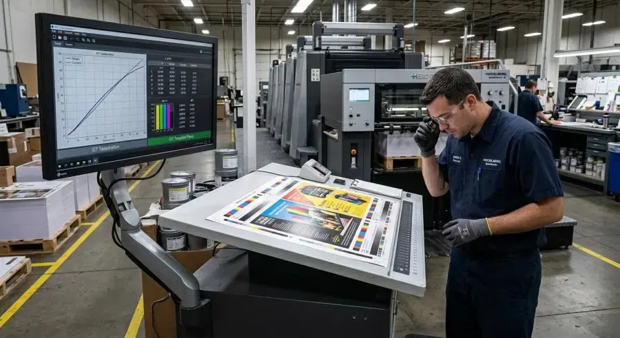
Step 3: Inline Monitoring
Modern presses measure color on every sheet using inline spectrophotometers — available today from Heidelberg, Koenig & Bauer, and others. Real-time ΔE alerts catch drift before it becomes a rejected batch.
If your supplier doesn't have inline monitoring, ask their sampling frequency. Every 500 sheets is minimal. Every 100 sheets is better. Every sheet is ideal.
Step 4: Incoming Inspection
When a shipment arrives, check before accepting:
Compare a random sample against your physical standard under D50 lighting
Measure ΔE with a handheld spectrophotometer ($2,000-5,000 from X-Rite or Datacolor)
Reject any batch exceeding your contractual
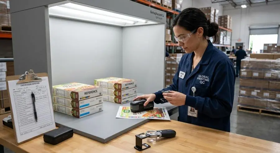 ΔE tolerance
The Tech Stack
Datacolor's cloud platform connects brand owners, converters, and printers through a single source of truth. Esko's Equinox extended-gamut reduces reliance on large spot-color libraries. SCREEN and CGS Oris demonstrated integrated color management for digital inkjet at interpack 2026.
5. When Things Go Wrong — Handling Color Rejections
Even with the best system, mismatches happen.
Common Disputes
Most color disputes boil down to one thing: subjective versus objective. "This green looks too warm" is subjective. "This green measures ΔE 3.5 versus the standard" is objective. The contract clause from Section 2.3 eliminates this argument.
The Resolution Framework
Measure, don't argue — Both parties agree to a third-party spectrophotometer reading under D50
Compare to tolerance — If ΔE exceeds your contract limit, the batch fails
Decide disposition — Reprint (supplier's cost), discount, or return
Preventive Contracts
Beyond the ΔE clause:
Sample retention — Both parties keep sealed samples from each run for 12 months
Batch passport — Supplier documents ink batch, press settings, temp/humidity for every run
Escalation path — Named contacts for quality disputes, with response time SLAs
Conclusion
Color consistency is not perfectionism. It is protecting your brand investment. Every time a customer sees two different versions of your "signature green" on the shelf, brand equity takes a small hit. Over time, those hits add up.
The fix:
ΔE tolerances in every contract — < 2.0 primary, < 3.0 secondary
G7+ certification required or equivalent
Incoming inspection protocol — measure, don't guess
Color standards kept current — replace annually
A few cents of color management per unit saves thousands in reprints. In a market where visual differentiation narrows, consistent color is a cheap competitive advantage to defend.
References
Datacolor. (2026). Brand Color Consistency with Cloud Tools. https://www.datacolor.com/business-solutions/blog/brand-color-consistency-cloud-color-management/
Printing Industries of America. (2026). G7 Master Spotlight and G7+ Community Growth. https://www.printing.org/content/2026/02/24/g7-master-spotlight--platinum-press
SCREEN Europe & CGS Oris. (2026). Advanced Colour Management Integrations at interpack 2026. https://www.screeneurope.com/news/screen-and-cgs-oris-showcasing-advanced-colour-management-integrations-at-interpack-2026/
Winpack Printing. (2026). Batch Color Variation Control for Rigid Boxes. https://www.winpackprinting.com/blog/batch-color-variation-control-for-rigid-boxes-one-stop-management-from-ink-batch-numbers-to-printing-pressure.html
Esko. (2026). Why Packaging Colour Problems Start Long Before Press. https://www.esko.com/en/blog/why-packaging-colour-problems-start-long-before-press