1. Introduction
The FIFA World Cup is a quadrennial merchandising machine. Stadiums fill, flags wave, products fly — paper hats, scarves, limited-edition collectibles. For packaging designers, it is a concentrated stress test: billions of emotionally primed consumers, multiple retail channels, 48 distinct national markets.
The paper hat is packaging at its most basic. A printed, folded piece of cardstock, handed out by the thousands at stadium gates. Functional, cheap, disposable. It works, but it also wastes an opportunity. In 2026, with three co-host nations and 16 host cities, the World Cup is the largest-ever laboratory for packaging innovation.
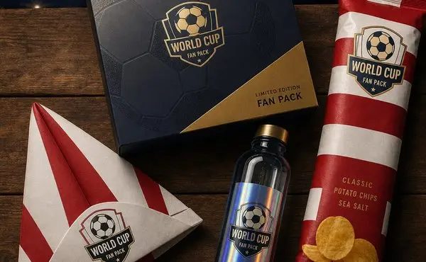
This article examines how brands are moving beyond utility packaging into interactive, collectible, culturally specific design. From Coca-Cola's football-shaped bottles to Lay's scarf-shaped chip bags, the question is: what turns packaging into something fans keep?
2. From Disposable to Collectible
2.1 The Paper Hat Era
The paper hat does its job. Low-cost, high-volume, easy to distribute. Stadium giveaways, vendor stalls, entry-level merchandise — all rely on the simplest packaging: polybags, paper wraps, cardstock headers. When you need to move 50,000 units in a single match day, complexity is the enemy.
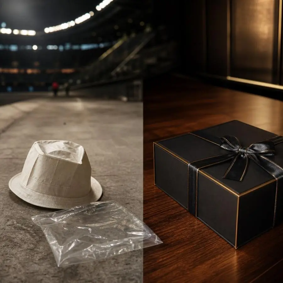
The trade-off is brand invisibility. A plain polybag with a printed logo adds zero perceived value. It signals "cheap" before the consumer opens it. In a saturated merchandise market where every vendor sells the same caps and scarves, packaging is the unused differentiator.
2.2 Packaging Becomes the Product
The shift happened when brands realized packaging does not have to disappear after unboxing. Make it desirable enough, and consumers keep it — extending brand exposure indefinitely.
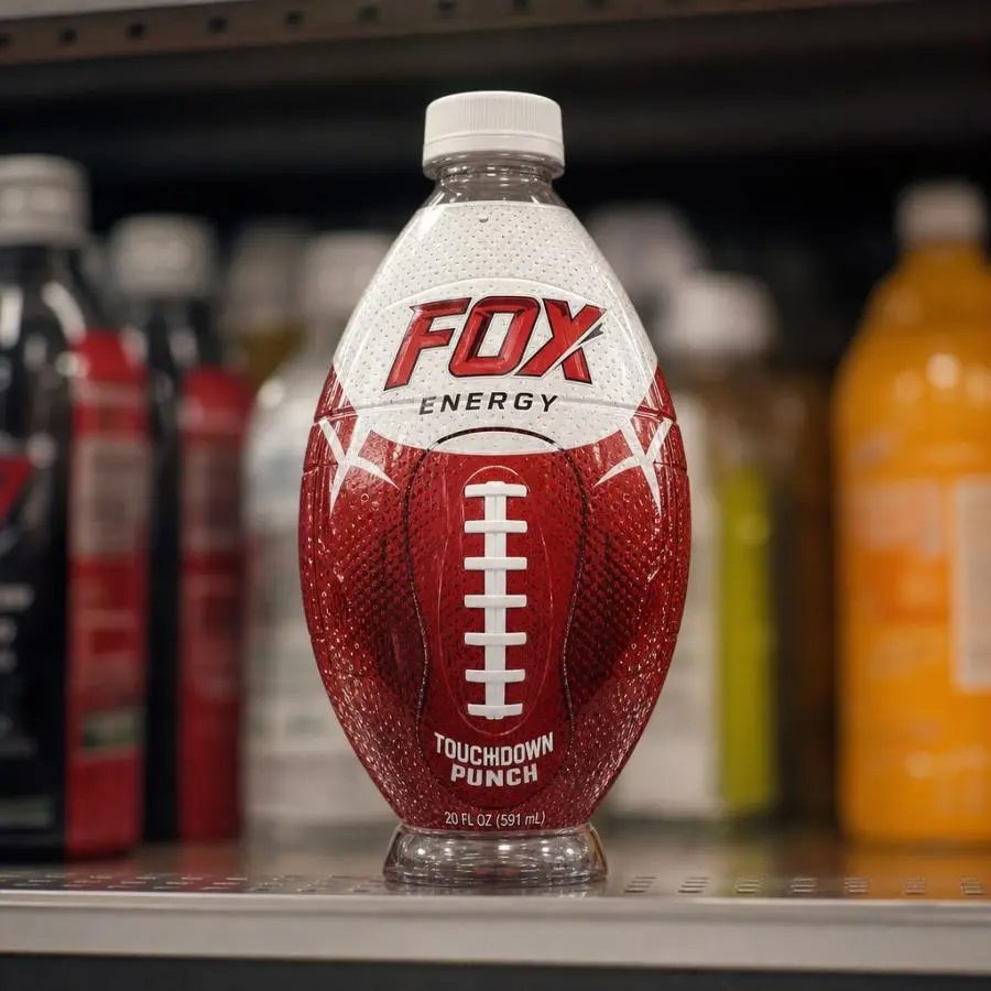
Coca-Cola's football-shaped bottles (2026) illustrate this. A PET bottle molded into a football shape transforms a commodity container into a collectible object. Consumers buy it for the bottle, drink the Coke as a bonus, keep the bottle as a souvenir. Packaging as product design, not container engineering.
Taittinger's limited-edition World Cup champagne works differently. Black bottle, holographic gradients in host-nation colors, textured label mimicking soccer-ball stitching. Only 350,000 bottles globally — scarcity baked into the design. The package says: this is special, this is limited, this is worth keeping.
Fernet Branca's "La Dorada" wraps the entire bottle in gold foil silkscreen. The full-wrap illustration creates a 360-degree canvas — no copy needed.
When packaging stops being a container and becomes an object, the brand relationship changes. The package is no longer a cost center. It is a marketing asset with an indefinite lifespan.
3. Four Design Strategies
3.1 Interactive & Gamified
The boundary between physical packaging and digital engagement is gone. World Cup 2026 packaging is designed as an entry point to a digital ecosystem.
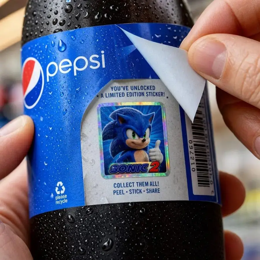
Coca-Cola × Panini hid over 1 billion collectible stickers under peel-back labels on 20-oz bottles. Each peel revealed a sticker — collect physically or scan into a digital album. The mechanic drove repeat purchases (collect them all) while bridging physical and digital.
Lay's printed QR codes on limited-edition chip bags linking to a WhatsApp channel with voice notes from Messi and Beckham. The package became a content gateway.
Design takeaway: Interactive packaging does not need expensive tech. A QR code, a peel-back layer, a scannable pattern — the cost is near-zero. The requirement is genuine value on the other side: exclusive content, collectible rewards, community access.
3.2 Localized & Culturally Specific
Forty-eight teams, three host nations. One-size-fits-all packaging does not work.
Coca-Cola's 8 country cans use national colors and kit-inspired graphics. Each design is culturally specific, not generically football-themed. The approach treats each market as distinct.
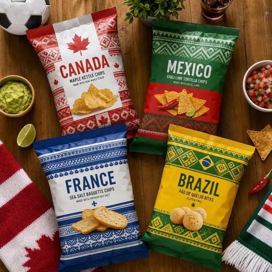
Lay's scarf-shaped bags go further. Designed by Rodolfo Baquier, the bags mimic football scarves — long, narrow, horizontal stripes — with country-specific flavors: Poutine for Canada, Taco for Mexico. The structure signals the cultural reference before the consumer reads a word.
Mexclart's "Calados del Alma" jerseys draw from papel picado, Mexican cut-paper folk art. Not packaging, but the principle applies: culturally specific visual language creates deeper resonance than generic sports graphics.
Design takeaway: Generic trophy-and-ball graphics read as lazy. Consumers respond to packaging that reflects their culture. A flexible design system with localizable elements beats a single global design.
3.3 Structural Innovation
Sometimes changing the shape is the design move.
Coca-Cola's football bottle is distinctive on shelf, recognizable at a distance, physically awkward to put down — which makes consumers pick it up. The round-bottom shape required R&D to adapt bottling lines, but the result functions as both container and object.
Budweiser's "Budstalgia" 11-bottle set covers every World Cup from 1986 to 2026. Each label reflects its era's visual style. Arranged together, the bottles become a chronological display. The packaging system is the narrative device.
Nike's clear display cases for limited-edition sneakers replace the shoebox with an acrylic pedestal. Consumers keep the box. It is part of the product.
Design takeaway: Structural packaging grabs shelf attention and generates social sharing. The shape must serve a purpose — display, storytelling, interaction — not just be different.
3.4 Premium Materials for Limiteds
Scarcity plus premium materials equals desirability.
Taittinger uses holographic gradients, textured labels, black glass. The materials signal "special" before any copy is read. At 350,000 bottles, the scarcity is real.
Fernet Branca gold-foils the entire bottle surface. The finish elevates a liquor bottle to display-shelf status.
Design takeaway: Premium does not mean expensive everywhere. Strategic accents — foil stamp, textured panel, holographic element — create perceived luxury at minimal cost. Invest where the eye lands first.
4. Sustainability Is Not Optional
The 2026 World Cup has stricter sustainability requirements than any prior tournament. For packaging designers, this is a design constraint, not a badge of virtue.
Karl Knauer's FSC-certified shaped adhesive notes and 3D-Pad Trio prove that sustainable materials support creative design. Soccer-ball shapes, embossed effects — all on recycled FSC paper.
Historical precedent: London 2012 required all event food packaging to be compostable or recyclable. Rio 2016 mandated recyclable and biodegradable materials across operations. The knowledge base exists.
The tension: Collectible packaging encourages consumers to keep it, which is less wasteful than single-use. But foils, laminates, and mixed substrates complicate recycling. Practical solutions: - Monomaterial construction — decorative effects through printing, not lamination - Design for disassembly — easy separation of decorative elements from recyclable base - Post-consumer recycled content — PCR for structure, virgin only for printed surfaces
Warning: Consumers and regulators detect greenwashing. "Eco-friendly" on non-recyclable packaging will backfire. Verifiable claims only.
5. Takeaways for Designers
Match packaging to channel. A stadium giveaway and a retail product need different packaging. Tier your investment by price point and distribution.
Design for the afterlife. Do you want the consumer to keep it, display it, or throw it away? Design accordingly. If it goes in the trash, use monomaterials and minimal decoration. If it stays on a shelf, invest in the structure.
Culture beats generic. Forty-eight nations, one design system — but make it modular. Changeable color schemes, adaptable copy blocks, regionally specific graphics enable localization at scale.
Digital is cheap leverage. A QR code costs pennies. The digital experience behind it determines the value. Make it a gateway to something worth accessing.
6. Conclusion
The 2026 World Cup packaging landscape mirrors the broader industry shift: from container to experience, from functional to collectible, from generic to culturally specific. The paper hat still has its place — it fits its context and price point. For brands willing to invest, the returns are measurable: repeat purchases from collectible mechanics, social sharing from structural novelty, loyalty from cultural resonance.
The winning packaging survives the final whistle. When the game ends, the packaging on a shelf — not in a bin — earned its place there.
References
- Coca-Cola FIFA World Cup 2026 Campaign and Packaging System — Pentawards (https://pentawards.com/directory/en/node/newsarticle-coca-cola-launches-fifa-world-cup-2026-campaign-and-packaging-system)
- Four FIFA World Cup Packaging Campaigns — Packaging Impressions (https://www.packagingimpressions.com/article/four-fifa-world-cup-packaging-campaigns-that-embrace-creativity-and-connection/)
- World Cup Packaging Goes Collectible in 2026 — Zappi (https://www.zappi.io/web/blog/world-cup-packaging-goes-collectible-in-2026/)
- Kick-off for the Promotional Products Business — Karl Knauer (https://www.karlknauer.com/en/company/newsroom/press/detail/promotional-products-world-cup)
- Best Food Packaging Designs Inspired by World Cup Events — Sowinpak (https://www.sowinpak.com/fr/blog/best-food-packaging-designs-inspired-by-world-cup-events/)
- Success Story: John Hatter & Co. Secures 2026 FIFA License — ISPO (https://www.ispo.com/news-article/sports-business/success-story-swedish-label-john-hatter-amp-co-secures-2026-fifa-license)